Large language models (LLMs) like the latest version of X’s Grok 3 have been shaking up the world of information gathering and academia. The ability of these programs to scour the web and gather data is undeniably impressive. But is the data accurate? Are their programs biased? And how do you get to the heart of a question?
Who could forget when Google’s AI platform Gemini couldn’t help but inject DEI (diversity, equity and inclusion) policy into historical images it was asked to create. A storm erupted when a picture of the US’s Founding Fathers replaced the historically accurate Anglo-Saxons heritage of these men with ones of African-American, Asian and Native American heritage.

I thought the launch of Grok 3 was a good time to test how AI is evolving. I started with some basic questions on the direction and governance of our nation. Contained among the lengthy response was a statement “Droughts, floods, and bushfires are intensifying.” Bearing in mind that these LLM’s gather data from articles, papers, posts and regurgitate it, I wanted to delve deeper.
“Are droughts, fires and floods really intensifying based on historical data?” I probed.
“Let’s dig into whether droughts, fires, and floods in Australia are truly intensifying, using historical data as our anchor. The claim gets tossed around a lot—especially with climate change in the mix—but we’ll stick to what the records say, not headlines or vibes. Here’s the breakdown, based on long-term trends up to March 2, 2025.” Replied Grok
While we have a relatively short dataset on Australia’s climatic conditions, Grok did indulge me.
Historical data demonstrated that droughts aren’t necessarily more frequent, but they’re getting more severe and prolonged in certain regions. Grok concluded not more droughts but hotter, drier ones that hit agriculture and water harder, citing an increase in temperature up 1.4°C since 1910.
Having seen the nation’s temperature rise being called into question due to a change from mercury to digital thermometers and the influence of heat sinks generated by construction, I probed deeper.
“How does the move from mercury temperature records to digital affect the temperature data?” I asked
“The shift from mercury thermometers to digital (electronic) sensors—mostly completed by the Bureau of Meteorology (BoM) in the 1990s—has sparked debate about its affect on temperature records.” replied Grok, pointing to four considerations.
Measurement differences:
Mercury thermometers, used widely pre-1990s, measure temperature via liquid expansion in glass, read manually once or twice daily (typically 9 AM and 3 PM). Digital sensors, like the platinum resistance probes in Automatic Weather Stations (AWS), record continuously, sampling every second and averaging over a minute. Mercury’s slow response smooths out fleeting spikes—say, a 30-second heat burst from a gust over asphalt. Digital sensors catch those blips, potentially pushing daily maxima up. BoM’s own tests (e.g., 2013 parallel studies) show AWS can read 0.3–0.5°C higher than mercury under identical conditions, especially on hot, windy days.
Siting and standards:
The transition overlapped with station upgrades. Pre-1990s, many mercury thermometers sat in Stevenson screens at rural sites—grass fields, less urban heat interference. AWS rollout sometimes moved sensors closer to heat sources (e.g., concrete, airports). A 2017 audit by the Australian National Audit Office flagged 20 per cent of BoM sites breaching siting guidelines—like Thredbo’s AWS near a carpark, skewing readings up. BoM insists adjustments (homogenization) fix this, but critics like Jennifer Marohasy argue the tweaks underestimate urban heat island effects, inflating trends by 0.2°C per century.
Data continuity:
BoM’s ACORN-SAT dataset, starting 1910, blends both eras, adjusting raw data to account for equipment shifts. The switch itself isn’t logged as a clean break—parallel recordings (mercury vs. AWS) ran briefly at sites like Rutherglen (1994–1996), showing AWS maxima averaging 0.4°C higher. BoM caps AWS readings at a 5-second response time to mimic mercury lag, but skeptics say this doesn’t fully bridge the gap. Result? Post-1990’s maxima likely edge higher—maybe 0.1–0.3°C—than if mercury had stayed. Trends (1.4°C warming since 1910) hold broad shape, but the rate might be slightly overstated, especially in heatwave records.
Bottom line:
The switch doesn’t “fake” warming—global datasets like NASA GISS align with BoM’s trend—but it nudges absolute temperatures up a fraction and sharpens extremes. Without unadjusted raw data (rarely public), it’s hard to pin the exact skew, but it’s not zero. Think tenths of a degree, not whole degrees.
Grok appeared quite considered in it’s response. Noting I didn’t ask about the impacts of deforestation, drying out of landscapes that could also contribute to the issue.
I did delve into bushfires more.
“How does the lack of management and traditional burn backs influence bushfires?” I asked
“The decline in fuel management—especially traditional Indigenous burning—and modern fire suppression policies have reshaped bushfire intensity. Here’s the data and logic:” replied Grok, with it’s reasoning.
Historical context:
Indigenous burn-backs, documented since pre-1788 via colonial journals and pollen records, used low-intensity fires every 2–5 years to clear undergrowth. Charcoal layers in southeast soils (e.g., Lake George) show frequent, small burns kept fuel loads at 2–4 tonnes per hectare. Post-colonization, European grazing and fire bans slashed this—by 1900, burning dropped 80 per cent in areas like Victoria’s Gippsland. Today’s eucalypt forests carry 10–30 tonnes per hectare, per CSIRO fuel assessments, 3–10 times pre-colonial levels.
Modern management:
Hazard reduction burns—controlled fires to thin fuel—aim to mimic this but fall short. In NSW, the Rural Fire Service targets 135,000 hectares annually; from 2010–2019, it averaged 120,000, just 1 per cent of public land. Victoria hit 130,000 hectares in 2023—2 per cent of forests—against a 5 per cent goal. Weather (narrow burn windows), funding (A$100 million/year vs. estimated A$300 million needed), and urban sprawl (smoke complaints) throttle efforts. Compare: Black Summer 2019–20 burned 18 million hectares—unmanaged fuel let it rip.
Fire behaviour:
Fuel load drives fire intensity. The Byram fireline intensity equation (I = H × W × R) ties heat output (I) to fuel weight (W). Double the fuel, double the energy—10 tonnes/hectare might yield 5,000 kW/m; 30 tonnes hits 15,000 kW/m, jumping from controllable to crown-fire territory. Black Saturday 2009 (15 million hectares) and Black Summer saw Forest Fire Danger Index (FFDI) values soar—100+ vs. a 1970s average of 25—partly due to drought, but heavy fuel turned dry spells into infernos. Indigenous burns kept FFDI-equivalent risk lower; explorer Thomas Mitchell noted “park-like” landscapes in 1836, rarely seen now.
Evidence:
Studies (e.g., 2020 Bushfire Royal Commission) link poor fuel management to 30–50 per cent higher fire severity. X posts from rural users—like “20 years unburnt, then boom”—echo CSIRO’s 2024 finding: unburnt sites near Sydney had 40 per cent thicker undergrowth than managed plots, doubling flame heights in tests. Suppression (putting out small fires) also builds fuel—decades of “save everything” left forests primed.

Bottom line:
Lack of burn-backs—traditional or modern—supercharges bushfires. Intensity’s up (50 per cent more extreme fire days since 1980s, per BoM) because fuel’s unchecked. Drought and heat set the stage, but 10–20 extra tonnes of dry scrub turn sparks into monsters. Managed burning is no cure-all—scale and climate limit it—but the data’s clear: neglect stacks the deck for bigger blazes.
Connecting the dots:
Hotter digital readings might slightly hype the drought-fire link, but the bushfire surge is more about fuel than thermometers. Both shifts—tech and land management—amplify perceptions of “intensifying” extremes, though the core drivers (warming, fuel loads) stand up to scrutiny.
It took some prompting, but we did get to some of the broader considerations of the original statement.
Having challenged the nation’s direction, I turned to the joy, or lack thereof, of humanity. I probed about ancient practices of yoga, meditation and our modern values. After a few back-and-forths Grok simple stated,
“Why Not More Joyful Already? Systems aren’t built for it. Capitalism thrives on scarcity—keep people chasing, not chilling. Schools churn out workers, not feel-good masters. Pharma’s a A$50 billion industry in Australia (2024)—pills trump prana for profit. And pain’s loud—joy’s quiet, so we fixate on what screams. X posts reflect this: “World’s a mess” gets 10x the likes of “Had a great day.” Attention bias skews us grim.”
What a time to be alive!
This article appeared in The Koondrook and Barham Bridge Newspaper, 6 March 2025.

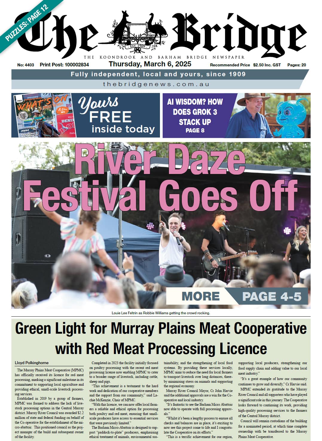